You’ve created a glorious website. You’ve worked hard to make sure that it shows you in your best light. You’ve created special offers that you think should resonate with your potential customers. You’ve been working in the industry for years and you know the audience like the back of your hand. You discover that no-one is clicking through on your calls to action. Your beloved site isn’t converting. You slowly turn crazy.
Why your calls to action aren’t performing like you think they should
- You’re overwhelming users with too many options
- Your CTAs are hard to find.
- Your CTAs aren’t optimized for mobile.
- You’re using the wrong language.
- You’re using a form that’s way too long and complex.
- You’re asking too much without offering anything in return.
- You’ve left out the benefits of your offer.
- Your color choices are all wrong.
- You’re leaning on a single conversion point.
To fix these issues, it’s a question of diagnosing the problem and making the repair. Think of yourself as a CTA mechanic. It’s time to lift up the hood and go and single-image out where the issue is and how to fix it.
Ways to fix your CTA problems
1. You’re overwhelming users with too many options
Have you ever popped down to your local Tesco’s and stood, mouth agog, as you scan the shelves looking for the type of sandwich you’ve like to feast on during your break? Ever noticed how long this takes? Have you ever given up and perhaps nipped off down another isle to get something a bit more ‘adventurous’?
You may be falling into the age old ‘fatigue trap’ which triggers something called ‘analysis paralysis’. I bet at some point during the week, you’ve put on your safe pair of old jeans you’ve worn every other day this week.
You may be activating the same phenomenon for your visitors with your website, by overloading their brains with too many possibilities.
Sheena Lyengar, a professor at Columbia Business School, spoke about the art of choosing in a TED talk she gave back in 2010. She said “Too many choices can overwhelm us and cause us to not choose anything at all. For businesses, this means that if they offer us too many choices, we may not buy anything”.
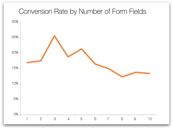
She proved this to be true with a study that showed significantly more conversions happened when shoppers had fewer options when making a choice. In the study, shoppers had to choose from a display with six different flavors of jam versus a display with 24 different flavors of jam.
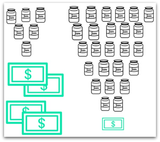
You can probably guess the outcome? The conversion rate for the six-flavors table was 30% and the 24-flavor table was only 3%. Less is more. LESS is MORE.
Much like too many choices can be a bad thing when it comes to choosing a jam, too many calls to action can also be overwhelming.
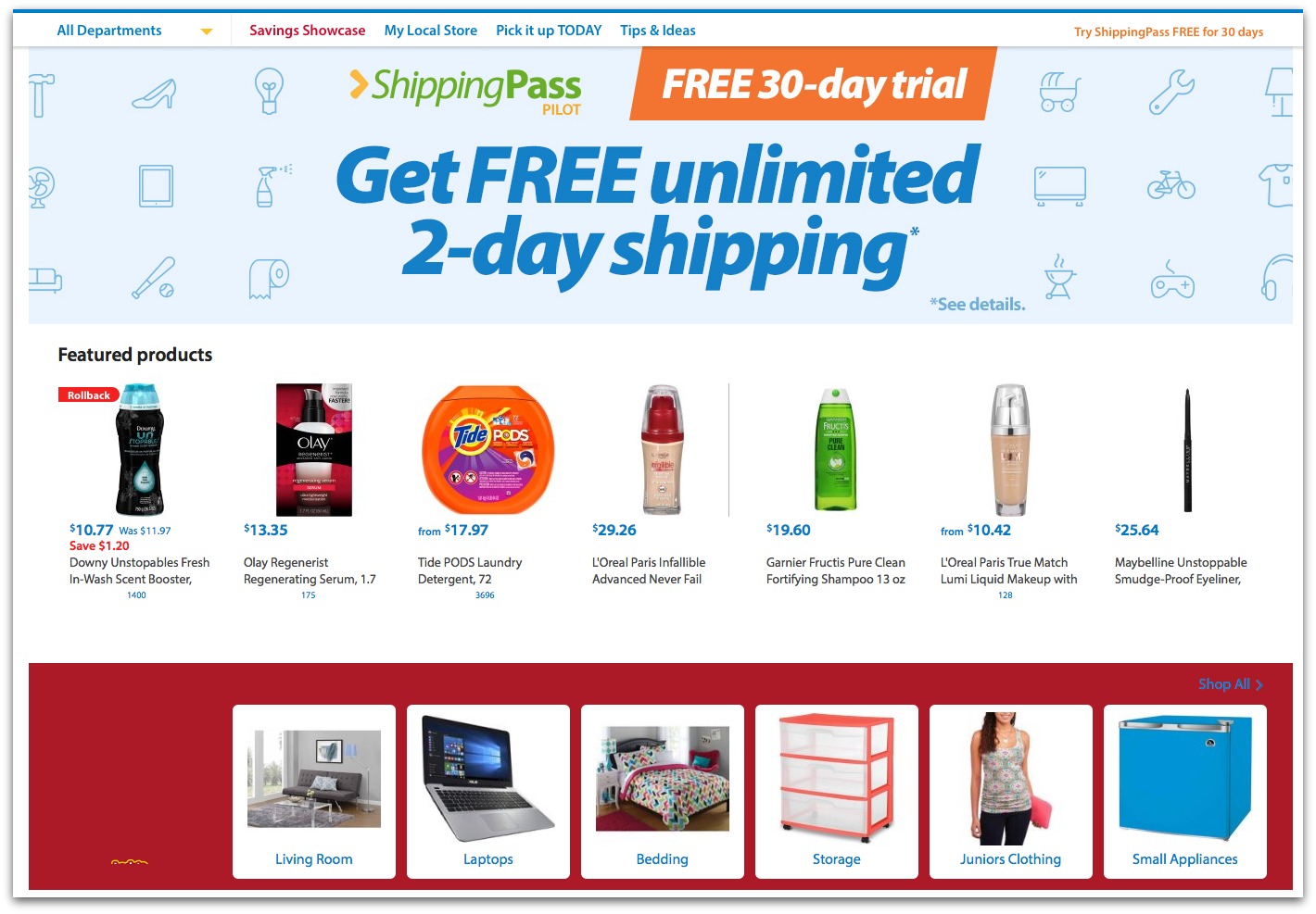
Need an example? Just take a look at Walmart – or most eCommerce home pages and count the number of calls to actions you find there.
They have CTAs for:
- Finding a local store
- A savings showcase
- Tips & Ideas
- A free shipping pass
- Featured products (which are completely random and not personalized, by the way)
- Products by category
With Wallmart, there are 20 different CTAs. These all represent decisions users have to make and it’s the first choice they need to make to delve deeper into businesses offering.
A contrast to this approach, are the home pages of Technology businesses which understand the importance of serving up less decisions or less CTAs. AirBnb, for example, serve up a single CTA. They understand what their users are looking for in most cases and make this the single CTA straight on the home page.
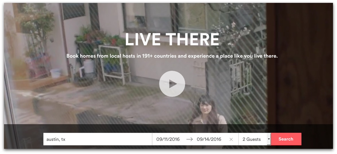
AirBnB’s single call to action encourages the visitor to start the journey down the funnel without any alternative paths to get in the way of conversions. They put all of the focus on the one CTA they want site visitors to use.
So, rather than forcing your website visitors to choose between 20 unique decisions before getting started, what are the alternatives?
How do you fix it?
Know what you want from your users. If you’re asking your users too many questions (like click here to contact us, click here to follow us on social media, click here to see more about XYZ product, click here to send a message, click here to subscribe) then you’re likely overshadowing your main goal. If you want your users to request a quote, then make this the only CTA they see above the fold. Focus on one main goal for conversions, and then use your CTAs to drive people through that specific funnel.
A/B Test to discover which CTA returns the best results. To know how humans behave is to correctly guess the lottery numbers for next Saturday. To uncover what your users want, experiment by serving up a number of different home pages which include different CTAs. For example, perhaps you have 2 home pages which are shown consecutively so each user sees a different version – include a single CTA on each, but perhaps for the first version you include a CTA asking for them to Click to request a quote and the second version asks them to complete a brief form for more details. Run the test for a reasonable length of time and your users will show you which CTA returns the best results. Then, scrap the least performant version and create a new version to compare against the previous winner – continue on forever and ever, keeping an eye on the results each gives and eventually you’ll end up with an ever-increasing return.
Reduce your number of CTAs Eliminating the low performing CTAs that get in the way of a site visitor and whittle your way down to the single most important path to conversion. Once you’ve eliminated the multiple CTAs begging for the user’s attention, you can focus on driving them down a single clear path.
Simple. You just discovered a stronger CTA.
2.You’re making your visitor work too hard
In the same way too many CTAs can feel overwhelming, asking for too much information can inhibit performance of your conversion assets, too.
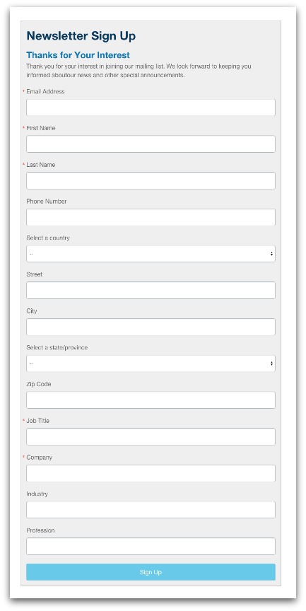
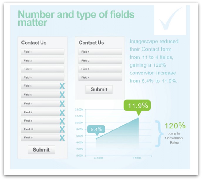
You’ve probably experienced this firsthand. Perhaps you’ve wanted to ensure that you have enough details to create a quotation for your customers. Perhaps your product requires that you know a number of different details before issuing an accurate quote? As you can see below, a long form looks ugly but importantly it also looks like a lot of work for users to fill in. Maybe this would deter would be enquirers as they may feel it likes 5 minutes to fill in when really, they just want to click and go. It’s asking for a big commitment before giving anything back.
Asking for too much user information during the opt-in process can make the user second guess conversion. Data proves that asking for less info in opt-in forms has a positive impact on conversion.
We’ve found that conversion rate increases by as much as 50% when you cut down the number of form fields from four to three.
ImageScrape found similar results when they reduced their number of form fields from 11 down to 4. Their conversion rate jumped 120%.
How do you fix this one? Only ask for must have data. If you need to collect more customer data down the road, you can. Getting users to submit the first enquiry is the challenge here and by stripping out information that isn’t essential to begin with, is the key.
Make some fields optional If you still want to leave the option open for leads or customers to share other pieces of data with you, indicate that those form fields optional.
Remember: The more you ask of users, the less likely they are to convert. Consider how valuable that extra form field is to your business in the face of overall conversions.
3. No-one can find your call to action
Sometimes, calls to action don’t perform because users simply can’t find them.
They’re either buried in text and graphics, they’re too far down on the page, they’re not in the common sight-mouse traffic area or they’re a text link instead of a prominent button that stands out from the rest of the page.
It may sound simple but if your users can’t easily see the CTA, they are less likely to action it.
What impact does it make when you do make CTAs easy to see? One label company found that adding a prominent CTA button increased conversions by a whooping 62%.
Other times, it’s the wrong type of call to action that’s hurting your conversion rate performance.
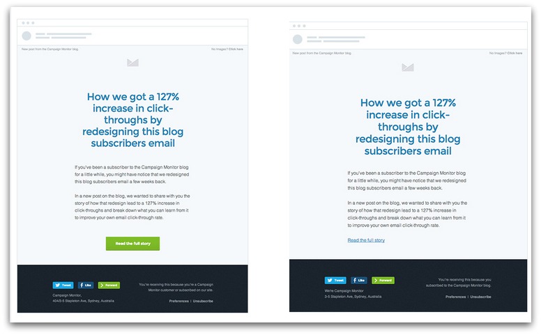
A technology company called Campaign Monitor discovered that using a CTA button instead of a CTA text link increased their conversion rate by 127%.
Astonishing, right? Making sure your CTAs are visible is crucial and can turn unsuccessful campaigns into gloriously success campaigns.
How do you fix this one?
Repairing a hard-to-find CTA means that you’ll need to perform a test.
A/B testing the existing version of the CTA versus an alternative design (one which makes the CTA bold or encapsulates it within a bold). Record the results and implement the version that generates the most conversions.
Doing this will give you a clear indicator of how to decorate your CTA to increase its visibility.
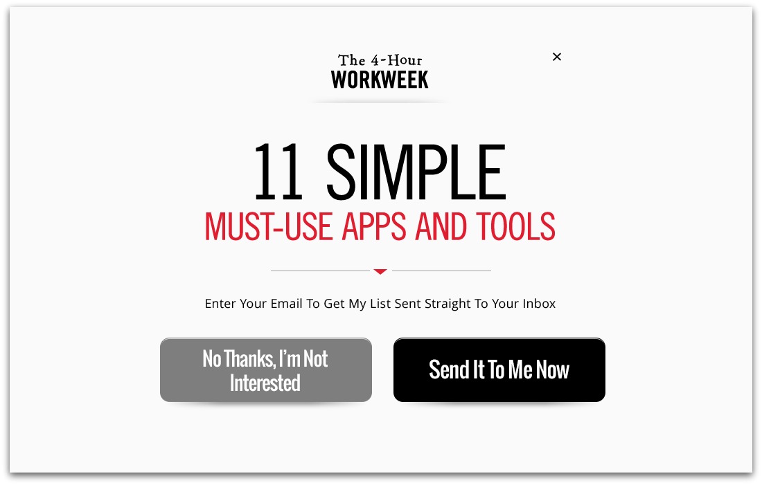
Leverage whitespace. Don’t crowd your CTA. Space out your content so that it stands by itself. A UX study showed that making use of whitespace increases comprehension by as much as 20%. An example of sufficient whitespace around a CTA can be seen on Tim Ferriss’s site.
Notice how the buttons aren’t crowded or lumped in with other copy. They stand out because they have an abundance of negative space around them.
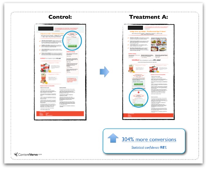
Consider placing your CTA below the fold. Clever, benefit driven copy helps move a visitor down the page and helps explain the value proposition to conversion before making the ask. ContentVerve conducted an A/B test that found placing the CTA below the fold increased conversions by an incredible 305%.
4. Your call to action isn’t optimized for mobile
Your CTAs may be well presented on desktop and have enough space around them to highlight them well but what do they look like on smaller screens?
You know how frustrating a non-mobile website can be. You manage to find a well serving business on Google search and when you click through, the text is smaller than you can read and the buttons are all overlapping.
With overwhelming data available showing that online users have transitioned to mobile devices as their main device for browsing the web, ensuring your website is responsive and appears legible on small screens is crucial for a performant CTA.
In 2014, comScore report showed that the number of mobile users surpassed the number of desktop users.
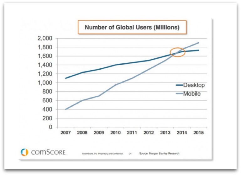
Then in 2015, Google reported there were officially more mobile searches than desktop searches overall.
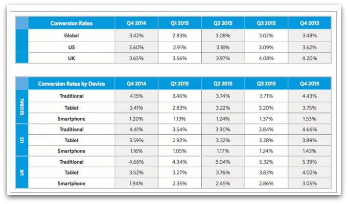
Interestingly, the number of conversions are comparatively lower than desktop users.
- Smartphone conversions globally increased from 1.2% back in Q4 of 2014 to 1.53% in Q4 of 2015.
- Tablet conversions globally increased from 3.41% in Q4 of 2014 to 3.75% in Q4 of 2015.
You need mobile-friendly CTAs. The increase in mobile traffic isn’t a trend or fad – it’s actually likely to continue increasing, if anything. If you haven’t already, it’s time for you to make changes and cater to your mobile users, too.
How do you fix this one?
Your website, landing pages and other marketing efforts like email campaigns, need to be optimized for mobile. This helps guarantee your text, images and CTAs are correctly displaying and are easy to read on small screens.
If these elements aren’t mobile-friendly, you’re creating an awful experience for the user by making them pinch and zoom to try and read your content.
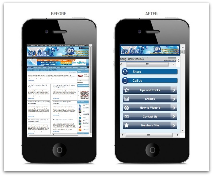
Neil Patel has a great example, comparing a responsive site vs a non-responsive site.
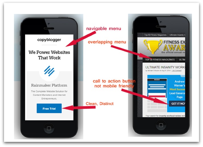
See the differences?
So, when you create your pages remember:
Buttons need to be large and not crowded. People use their fingertips to click on things on mobile devices. If your CTAs are too small or close together, it will create a miserable user experience and you’ll likely frustrate the person trying to use your call to action.
You’re working with smaller screen sizes, so less is more. Create layouts that are clean, spacious and easy to read/see.
5. You’re using the wrong words/not enough words
The words you’re using in conjunction with you call to action matter more than you think.

Which wording is more compelling to you? The one that invites you to try something or the one that demands you make a purchase? There are so many ways a slightly tweak to your wording can make a positive impact on your conversion rate.
For example, you probably don’t want to include
- Using generic wording
- Using the same CTA wording for distinctly different segments
- Using 2nd or 3rd person in CTA copy
- Using cumbersome action verbs
- Omitting a sense of urgency
- Forgetting to address your lead’s anxieties and concerns
- Leaving out your value proposition
Do any of these sound familiar?
How do you fix this one?
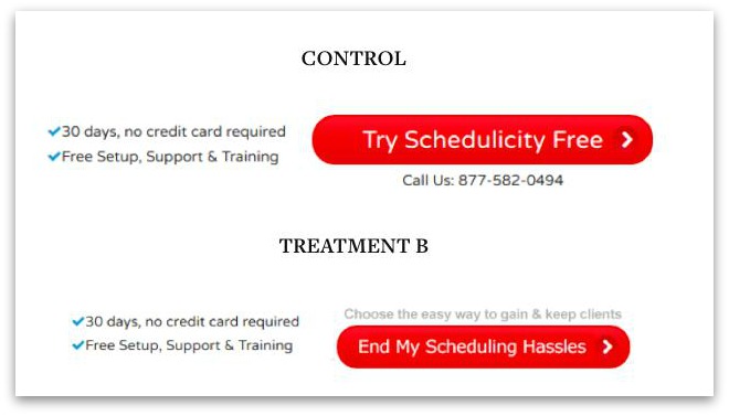
Use First Person. Research and A/B testing shows that using ‘my’ instead of ‘your’ in CTA text is often much more effective at driving conversions. In fact, when Schedulicity tested a first-person vs third person CTA, they found that the third person version boosted conversions by 24%.
Remove friction words.
- Buy
- Sign Up
- Submit
- Give
- Invest
- Donate
- Sponsor
- Support
- Complete
If they’re part of your current CTA, they’ve gotta go.
Leverage Microcopy It could be that you’re not using enough words in your call to action.
Microcopy is the text you see on and around call to actions that is both instructional and encouraging for the reader. It helps eliminate uncertainty and anxiety about what’s on the other side of the call to action by providing some brief details that reassure the reader it’s worthwhile to pursue.
It also answers questions like “What happens when I click here?” or “What should I search for?”.
Take a look at Misterbandb. Notice the microcopy within the boxes that tell the site visitor exactly what to do within those spaces to move forward. If you were a new user to this site, the microcopy here would help eliminate any doubts or questions you had about how to use the main CTA.

6. You’re asking for money before providing value
Users end up looking at a CTA you created because you’ve attracted them from somewhere. The user didn’t open up their browser and say ‘Internet, show me a random landing page”. They either followed a contextual link, clicked on an ad or found your site by searching for something relevant on a search engine.
The issue is that this audience includes a wide variety of people who are at different stages of the sales funnel. Some are ready to act right away, while others are still debating whether or not this option if for them.
If you’re asking them all to buy straight away without offering anything up front, you may be coming across as a little too forward.
With a discount or free offer, you’re offering an opportunity for an initial conversion. From there, you can follow up with them and help move them down the path to taking action and making a purchase.
Getting your foot in the door with this early conversion can help drive up other conversion rates down the road.
How do you fix this one?
Establish a free trial/discount offer. Depending upon your business, it might make more sense for you to offer a free trial or a small 10-15% discount as a way to offer something upfront. Make sure you are collecting name and email addresses but keeping the opt-in simple.
Fine tune your sales funnel. From here, continue the conversation with these leads and offer them value on an ongoing basis. Follow-up via email. Ask for more details about their needs. Continue to drip feed them helpful relevant content to them so they can move further down the path to conversion.
If you do this well, then when you do present the sales opportunity CTA, you can expect stronger performance and of course, more sales.
7. You’re leaving out the benefits
Look at these two special offers.
- Offer #1: Our eBook on Email List Growth
- Offer #2: 5 Steps to Getting 10,000 Email Subscribers in 6 Months (FREE eBook!)
Which one of these is more appealing?
Option 2 is clearly more compelling but why? Benefits!
Generic copy that doesn’t tout the benefits of your CTA will struggle to motivate people because it forgets the ‘what’s in it for me’ angle. Which is the standard mentality for website visitors. Shocking? We’re all selfish creatures.
How do you fix this one?
Be specific about benefits. It’s not enough to throw in words like ‘free’ or ‘valuable’. You really need to bring it home by explaining why the benefits are so valuable and what specific outcome the user can expect as a result of taking action.
Speak to pain points. You know what your target customer struggles with so tease out those areas of friction in their lives and then tell them how you’re going to solve those problems.
Don’t stop at one. Use different angles to drive home benefits. Expand upon the variety of benefits your CTA can offer.
8. You’re not using an action colour
Is there a magic button colour that will guarantee a higher conversion rate?
Nope!
In fact, ConversionXL conducted an extensive research project and concluded the following “Saying that one color converts better than another is simply stupid. There is no universal best color. What works on one site, doesn’t necessarily work on another”.
While some studies have indicated certain button shapes and colours outperform others (like the example below from ContentVerve), it doesn’t mean there’s a sure-fire button colour for each and every use case.
If you thought Green was the only acceptable colour for CTA buttons, and you placed them on a green background – would they still be super affective? Nope! They’d blend right in!
If your buttons aren’t performing because you’re not using an action colour, here’s what you need to know.
How do you fix this one?
Make CTA buttons a colour that contrasts with the background. In doing this, you’re ensuring they’re easy to spot on the screen. For example, look at how Fedora uses navy blue buttons against its white backdrop to make them pop from the page.
A/B test different colours. You’ll find that the best action colour is the one that produces the most results. Testing variants is a sure-fire way of discovering which colour this is. In case you haven’t realised yet, A/B testing is a systematic way of winning the lottery each and every time!
9. Your follow up is lacking
If you’re leaning on a single CTA to drive all of your conversions, you’ve likely got some room for improvement. Why?
Because you’re missing out on follow-up opportunities that could boost your conversion rate. Don’t put all your eggs in a single basket – create multiple opportunities from a single CTA and have multiple swings at the ball. For example, maybe your visitor isn’t ready to convert when you present the welcome mat opt-in but after reading your amazing blog post, that visitor thinks “Okay, they really know their stuff”.
How do you fix this one?
There are a few different ways to fix this one.
For example, say you’re attempting to drive conversions for newsletter sign-ups. You have a CTA in your welcome mat that greets the reader at the top of the page but then you also have other conversion opportunities such as.
- Text links to your CTAs within the text
- An exit intent popup that populates when a user is about to leave the page
- A CTA at the bottom of the page
- A sidebar CTA
Just remember – Your CTAs should be working together toward a single goal, not fighting each other for the reader’s attention. Create multiple opportunities for conversion without overwhelming your audience with too many different conversion paths. KIF – Keep It Focussed.
Spot your CTA problems and fix them. Make your calls to action perform better than ever and do it methodically.
Your Call to Actions suffer and generate lack-lustre results when.
- Overload users with too many options.
- Are hard to find on the page.
- Look like garbage on a mobile device.
- Use the wrong words and don’t incorporate smart copy.
- Include mile-long forms with a gazillion different fields.
- Don’t entice leads with some sort of offer/discount in return.
- Don’t use colours that pop from the page and make the conversion path obvious.
- Forget to mention all of the kick ass benefits.
- Don’t give the user enough opportunities to take action.
If you’ve read this article in full, you’ll now be equipped to revisit your existing CTAs and plot a course forward to fix any issues you have. You’ll know that A/B testing is a great strategy for discovering issues with your funnels and you’ll know where to start when attempting to fix them all. Wonderful! How nice.