The Facebook ad platform has been maturing for years now and whilst it may still be buggy and suffer from a broken UI, it’s still a great way of reaching your audience. In this article we’ll be sharing five valuable lessons we’ve learnt from running Facebook Ads for our clients. We’ll walk you through each lesson below and help you to run a successful ad campaign for your business.
1. Use a single CTA and keep it simple.
All campaigns or ad formats are designed either to (1) Engage your prospect’s attention or (2) drive direct action. Simply put - You’re going to be driving a sale, an app install or generating a sales lead.
If we lived in a perfect world, your ads would achieve both. In most cases, you’ll either get one or the other. Brand awareness is valuable for any size of business and it’s an intelligent use of adverts for your business over the long term. Too many campaigns try to mash brand awareness with direct response but unless you’ve been running ads for a long-long time, it rarely works.
Creative brand awareness campaigns are always better served with CTA (Call-To-Actions) related to content consumption like following your Facebook page, subscribing to receive more of your blog content or collecting email address subscriptions to generate an active community. Direct response ads are better served answering frequently asked questions or resolving common objections rather than trying to engage or entertain.
A superb example of a direct response ad comes from the company AppSumo. You’ll see from the example below that the ad has one clear goal: to get you to immediately buy the product.
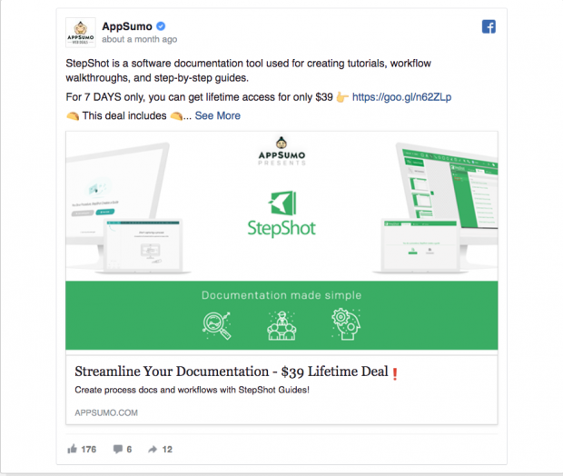
It’s a hugely efficient ad and doesn’t waste a word – it tells you what the product is, what the deal includes, limits the time frame it’s available in and provides a really compelling reason to buy right away.
Mailchimp is one of the heavy weight advertisers who apply brand advertising extremely well. The clever part of their campaigns is that they let brand awareness build the brand. Their Facebook ads never really get you to watch one of their videos AND sign up for a trial. It’s always one or the other – direct vs awareness. Lots of Mailchimp ads are designed to drive sales or get customers to try new features. They keep these two worlds very seperate and because of this, they get the best results.
Decide on a single action you want your audience to take and double down on it. The easiest way is to focus your ad on one section of the purchase funnel below.
• Awareness, affinity and consumption
Stick to first handshake CTAs such as boosting followers, encouraging content views or email address submissions for newsletters.
• Conversation
Focus on engagement metrics such as boosting content shares (over Facebook, Email, Twitter), increasing comments and tagging or simple generating positive mentions.
• Intent
Focus on next step CTAs such as ‘Learn more’ or driving downloads of your gated content.
• Conversion
Focus on actions which lead directly to revenue such as adding products to a cart, requesting sales demos, downloading apps or signing up for a subscription SaaS product.
2. Apply an audience targeting strategy that you can refine over time
You’re not going to get your targeting spot on straight away. Facebook offers an endless list of audience targeting abilities. It’s easy to get overwhelmed with all of the options available – a lot of folks don’t spend much time on this aspect because it’s just so extensive but it’s also a crucial element of a successful Facebook Ad campaign.
The trick is to setup a lookalike audience to let you improve your insights into what works over time. Here’s a quick example of a good path to take.
• Navigate to the Audience section of your ads manager.
• Click Create a Lookalike Audience.
• Choose create Custom Audience and then select customer file.
• You can then add an Excel file of customers – for example, your email list or a list of customers from Paypal.
• Chose the country where you’d like to find similar sets of people.
• Choose your desired audience size with the slider.
• Click Create Audience.
If your ultimate goal is to target the most potential lead prospects, you should create a lookalike audience targeting one or two percent of the country’s population instead of aiming for 10%+. For the best results, exclude custom audiences of people who have already converted.
Over time, refine your targeting with demographics, locations etc.
After running your campaign for a week or so, you can then adjust your audience targeting by adding tweaks. Add these one at a time to see if they make an impact – you’ll want to leave enough time between tweaks to show you what works (or doesn’t).
To do this, choose target location. Then add on interest. Then demographics. Then narrow your audience by adding required categories – such as the user must be interested in X and also must like Y or Z. Using combinations of interests will allow you to become really specific with the type of audience your ad is shown to.
Under behaviors you can target specific device owners, people who have an anniversary within the next two years (for example) or users who have recently made a business purchase.
An additional (perhaps more expensive approach) is to start by testing broad audiences and then adding more specifics as you go getting more and more refined and higher converting audiences every time.
3. Write clear and conversational headlines
A good Facebook ad doesn’t annoy people with boring benefits or salsey pitches. Good Facebook ads use a conversational tone and a laid back attitude to asking for a sale.
Through working with hundreds of clients, the Growth Architect’s team has discovered that headlines work best when they are natural sounding with a conversational style. Remember where these ads appear – using a conversational tone reduces irritation because it’s less intrusive and as these ads appear in personal news feeds, this is key to getting traction.
A good headline is a clever turn of phrase. Other times it’s a straightforward product benefit. There aren’t any hacks to good writing – just an intelligent use of language and context. A good headline doesn’t even need to contain a benefit – it just needs to catch attention using context which resonates with its audience.
If you know of brands currently advertising on Facebook, my advice is to follow them. Follow the ones which you feel have mastered the aesthetic and social codes of Facebook & Instagram and borrow from them. You’ll notice a lot of commonalities between the ones you like and the ones you don’t so cherry pick – there isn’t any shame in standing on the shoulders of giants.
Your headline in a Facebook ad is typically the ‘text’ field in the ad builder, not the headline field. You may have noticed in Facebook’s ad builder that the headline appears in the third position in the ad under the image. This would actually make the headline the second thing you read in the ad – clearly designed by a non-marketer.
If you enter the copy in the ‘text’ field, threat this as your headline. It’s the first thing your audience will see and the headline functions more like a sub-header for additional context/information.
4. Use an image that reinforces the headline
Amateur advertisers on Facebook make a predictable mistake. The image and the headline do not have any correlation or tension. If the headline is ‘make money in your sleep!”, you’ll see a stock image of a person in pajamas, holding handfuls of cash. Or is the headline says “become a social media jedi”, you’ll see a social media manager dressed as a jedi.
A good example of strong imagery with a strong headline is below. If the copy is literal, make the visual playful. If the visual is playful, make the copy literal. It creates intrigue and contrasts, grabbing attention and puling in your audience.
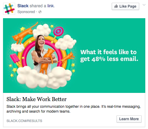
Slack (above) is famous for abstract images. The headline copy is fairly straight forward, explaining the metaphor. This would be a very different campaign is the image was just as straight forward as the title – it would be far less attention grabbing. In this case, it’s the tension between the copy and image which helps it work.
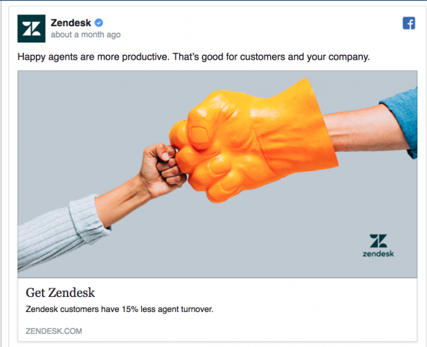
Zendesk are also masters at this technique. How dull would it be for Zendesk to replace the image below with a picture of a support rep sitting at their desk? It would be lifeless.
5. The description area should remove friction for the CTA
Your final step is to construct a description for your CTA. This is the News Feed Link Description. Use this space to answer frequently asked questions or common buying objections.
If your CTA is “Download your report” a common objection might be the value of the report. Answer this explicitly to increase the number of people who click on your CTA.
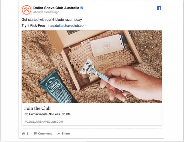
You can see that the Dollar Shave club above uses the description area to answer these common objections simply. “No Commitments. No Fees. No BS”. Perfect.
If you’re an e-commerce site, perhaps you need to clarify the cost of shipping before your audience will click. If you’re selling fruit online, perhaps you need to address the risk of bruising and how you avoid it. If you’re a consultancy, perhaps you need to address details of your expertise before they click. Whatever your service or product is, address the common objections here and increase the number of folks who click through.
If you’re running Facebook ads, we hope this has helped you define the areas where you can improve its performance and get the most from your campaigns.
