It’s time to build your small business a website. You’ve squared away a few weeks, seconded your nephew and grabbed a coffee. Today is the day you start your small business website. You’ve heard that your business needs a website otherwise you risk being forgotten along with wind-up analog clocks, crocs, jellied eels and bowler hats.
About you
You’ve got customers already. They’re happy with their dealings with you and they’ve gone on to continue to use your products or services. Rather than finding your customers, they found you through word of mouth – perhaps one of their neighbors used you and suggested to a friend or neighbor that they should give you a go. You’re quite happy as customers track you down on a fairly consistent basis but as you’ve grown, you’ve ran out of referrals. They haven’t dried up per se but they don’t give you the numbers to grow as quickly as you want and generate sufficient cashflow to start hiring new recruits, upgrading your equipment or give you the time out you’ve been looking for over the years. The last time you took a real holiday (a Hunstanton weekend doesn’t count) has been a really long time.

What you’re really looking for is a way to take control over your small business’s growth. It’s great that you have customers and it’s great that those customers are telling others about you but what can you do to pull in more customers – and take a proactive role in acquiring new customers.
What do you know about your current/previous customers?
The journey to building out a new website for your small business starts in the past. By looking closely at the types of customers you’ve serviced and made happy, you’ll uncover what you need to include (or exclude) on your website.
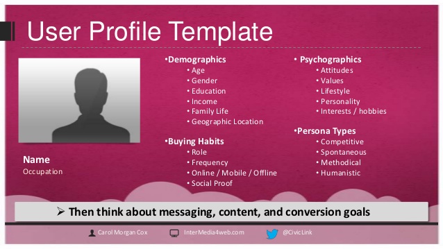
With your first coffee in hand, take a look at your customers and see if you can see any commonality between them. There will be similarities – there always is. When you’ve found them, write them down. Try and define a few of the characteristics like the ones below.
-
How much they spent with you
-
Where are they physically located?
-
What product or service did they purchase?
-
What problem did you solve?
-
What is their gender, age, income, occupation, experience etc.
-
What questions did you answer?
-
What was their work experience?
If you can’t group all of your customers together, break them out into a maximum of three groups. For example, you can divide them up into spend, product and experience. You’ll want to group them using a characteristic which is shared by one another – this will come in handy when it comes time to creating website content targeting each one of them.

For example, what if you could divide your groups into best customer, good customer and ok customer – and create content which appeals to each one of them. It would be as valuable as being able to pick up the phone and speak to your perfect customer to get them interested. Hugely valuable.
Now we know who your customers are, what’s the next step?
By now you’ve got at least one group of customers that you can target with your new small business website. Let’s say that we want to target a profile which represents your perfect customer – You’ve discovered that this group of customers is 30 years old, mostly male, good career but time-poor and they’ve already used your product before.
So, the question is – What would this person want to find out about your business before proceeding with a purchase?
He’ll want to know that your business can save time. He already knows how to fix the problem he has but he doesn’t have the time to do it himself.
He’ll want to know that he can trust your business to do a good job. He doesn’t want to revisit the same problem further down the road.
He’ll want to know if the product he’s used before is still available and if it changed. As he’s a previous customer, he’ll want to know if anything has changed since he last used it or if he should be prepared for a change in feature set, capabilities or pricing.
How do we present the answers to your perfect customers’ questions?
There are lots of ways to present the information your customer wants to know. The best way to lay it out is to make it as simple as possible to find it, read it and act upon it. These 3 core elements will ensure the customers that do find your new small business website, will be able to find the answers to their questions quickly.
Start with drawing out how your website will be structured. Use rectangles for each page and lay these out in a tree hierarchy. The first rectangle will represent your home page (typically the first page visitors will see), underneath this will be your secondary pages which may include contact us, about us, services, quotation pages – but it depends on what information you want to surface to capture the attention of your perfect customer.
Here’s an example, using Growth Architect’s website.

You’ll see that we’ve broken out our information over several different secondary pages such as Previous Projects, Services, Blog, Contact us and Home page. You’ll also notice that we’ve tried to push interested customers through our Services page and then offered up a variety of services which can be clicked through to view.
Why?
Well, because there is a balance between ease of use and ability to monitor its usage/consumption. If we wanted to solely make this easy to use and not worry about collecting statistics, then we would look to making the structure far flatter. Perhaps we would list all of our services in detail under the one page ‘Services’ so that customers could scroll down to view each one (rather than click). Why didn’t we do this?
It’s important to strike a balance between usability and ability to measure the usability.
If we create a single page and place all of our content on it – we wouldn’t have the ability to understand which pieces of that single page visitors found the most useful. We would just see that someone viewed that page then left or submitted an enquiry. The key here is by breaking out the information into multiple pages, it makes it far easier to monitor each page’s impact – we can see how many visitors click on our Services page and we can then see which service they click to view more on. Eventually, this will show us how many of our visitors like each one of our services e.g. 50 customers view the Services page and then 25 view our Website design page and 25 view our SEO Page. Perfect – we now know 50% of our audience was interested in our website page and the other, were interested in our SEO page. Perfect!
If we then see out of those 25 views of the Website design page only 1 leaves a message or calls us, then we know we have got a long way to go to persuade the other 24 visitors of the value of this service. Get it? Hugely valuable. Hugely.
Remember – whatever you introduce onto your website, make it measurable. If you can’t measure it, don’t do it.
So, what do you put on your home page?
The key here is to make it simple and specific. Back in the day, you would want to try and make your home page as general as possible because it was usually the page which showed up the most for all sorts of search terms. If you were a lawyer, you would see your home page appear for all sorts of associated terms like ‘business lawyer’, Employment lawyer’ and maybe ‘mergers & acquisition’.
This would mean that you had to cater to all of these different types of customers – customers looking for all sorts of services. As time as gone on, search engines have become more intelligent and complex and now successfully show the most relevant pages to potential customers. Using the above example, those searching for ‘business lawyers’ will be presented with the page on your website talk about business lawyers. Those searching for Employment lawyer, will be shown the page on your site talking about employment lawyer.
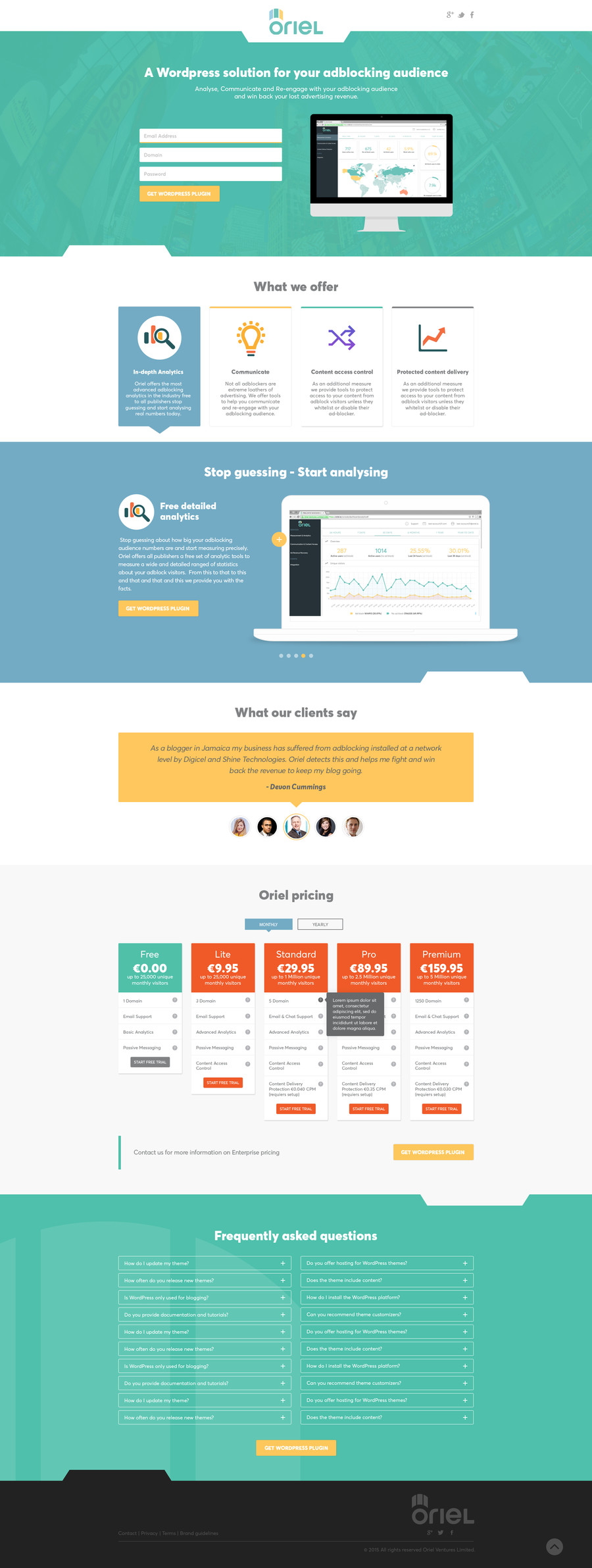
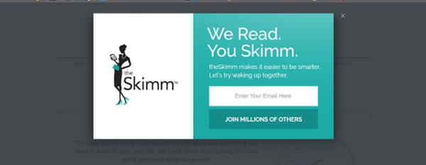
On your homepage you should target your perfect customer and service them well. Refer to your customer profile and answer the top 3 questions clearly & concisely. If your perfect customer needs to know about previous projects, quality of work, brands you work with or how much time you can save them – put it right there. Now that you’ve managed to get their attention by answering questions you know they need answering, you now want to encourage them to reach out to you. Somewhere on your home page you want a single CTA (Call-to-Action) which invites the visitor to submit a contact form, make a call or express their interest in another way – something actionable a visitor can execute to express their interest. Just the one CTA – you don’t want them to be overwhelmed with decisions. Stick to 1 CTA and push them towards it but only after you’ve answered their questions and educated them on to why you are right for them.
Additionally, somewhere more discrete, place some suitable links to other pages serving other types of customers. For the more price conscious customers, perhaps place a link further down the home page which links to a page talking about getting the most from their budget or ways to cut down on costs. Remember – you’re not targeting the questions; you’re targeting the customer type and answering their questions.

And, what do I use the other pages for?
Ok. So, let’s presume that you’ve looked at your previous customers and you’ve managed to segment them into 3 distinct groups.
Let’s also assume that all of them will want to know the basics about your business. Let’s say that they will want to know 1. How to contact you, 2. Where you are based and 3. That your business is established/experienced.
To answer these questions, you’ll want to create a page called Contact us / About us / Quotation Page. Simple.
Now let’s get back to serving your specific customer types. You have your Perfect Customer, Good Customer and ok Customer. Let’s say that your Perfect Customer finds you on Google search by looking for the name of a specific service you provide. Now, your Perfect customer will have questions – systematically answer these questions and related them back to the particular service. For example, someone finds your website by searching for ‘business lawyer’ and because this is one of your services, you have a page describing the services you provide to businesses. Within this page you’ll want to answer the questions your perfect customer has. Perhaps they want to know which services you offer to businesses, which other businesses you’ve successfully serviced and how to enact your services.
You’ll also want to highlight a CTA – probably, you’ll want this to be a ‘request quotation’ option or ‘download our latest whitepaper’.

So now you have a web page on your website that perfectly highlights your business lawyer services in a way which answers your Perfect Customers questions…and you’ve got a nice clean CTA to encourage them to contact you or hire your company.
Repeat as needs be. If you have 10 different services, build 10 unique pages – each answering questions from your perfect customer. If you’ve got time, you may also want to place a few options on this page to filter out pages targeting your Perfect Customer, Good Customer & ok Customer. But if time is tight, keep it simple and target your pages to service just your Perfect Customer.
Eventually, when you’ve created a Homepage, Contact us, About us, Quotation and Service Page(s) you’ll have a website which appeals to a specific type of customer. And because you spent the time performing a little research, your website will be highly targeted to appeal to customer type you know is interested in your business, has sufficient budget and is keen to buy.
If you’re feeling snazzy, you can also experiment with the content on each page. We know what questions customers have but we don’t know how best to present the answers. Using A/B testing enables you to have two versions of a page and record how well they convert customers – for example, you could have two pages which discuss the same business lawyer services but in slightly different ways. Perhaps you can bullet point a paragraph or include more images in one version than the other. A/B testing your pages will give you more insights and that’s what we’re looking for here – metrics from visitors using your website that we can then use to adjust the website so that it works better.


