


The first page, or homepage of your website acts as an introduction to your brand and a set of coded instructions meant to help new and existing customers navigate your business to discover what they need. Every single detail should build momentum towards making a strong and lasting first impression whilst encouraging an intended action, whether your goal is to sell your products through e-commerce or capture email subscribers for a newsletter.
There isn’t a single way to design a homepage. However, here are some general tips to bare in mind as you plan your homepage from top navbar to bottom footer, whether you’re building your first store, working with an agency to or simply revisiting this crucial page of your website.
What questions should you ask when designing your homepage
It’s wise to consider that a homepage may work perfectly for one business and fail miserably for another. If you’re looking at design options and are unsure of which direction to go in, here are a few questions from our design team to help guide your decision.
What is the action you want your visitor to perform? Eg. sign up to your newsletter, purchase your product, submit a sales enquiry etc. How simple can you make this process for them? What is the lowest number of clicks required to perform this action? How much information do you request in order to complete this action? How can you reduce the steps, minimise the information required or increase the time it takes to complete the process?
Occasionally, your website guests will land on a homepage knowing what they want, and other times they may not. You have to design your homepage with both in mind while ensuring that your decisions align with your primary goals, above.
A good homepage should accommodate visitors looking for a specific outcome, whilst directing the attention of the ones who aren’t.
What outcomes should your homepage design support?
On average, visitors will spend 10-20 seconds on your homepage. Ten-to-twenty-seconds. That’s it! What this means from a design perspective is that you need to make the navigational flow clear so visitors can quickly choose the best path for themselves (and for your business).
Adding to this urgency is a psychological phenomenon called “decision avoidance,” which is the tendency of humans to avert a decision that takes too long to make.
The homepage should avoid this situation at all costs, ensuring visitors have the opportunity to make a choice but avoiding situations where they have too many decisions or the decision is too difficult. To prevent this, the first task of your homepage should be to persuade potential customers to stick around.
To do this, you’ll need to understand the role of your websites most valuable real-estate.
1. “Above-the-fold” content that captures attention
When web designers discuss the homepage, they usually refer to a coveted place called ‘above the fold’, they’re referring to what visitors see before they decide to scroll.
When thinking about what lies above the fold and how that accompanies the rest of your homepage, focus on the specific actions your visitors need to make to complete your goals when they first land on your website, the information they need and how you can serve up what’s needed to help them make their decision.
Using Google MyBusiness to grow your business
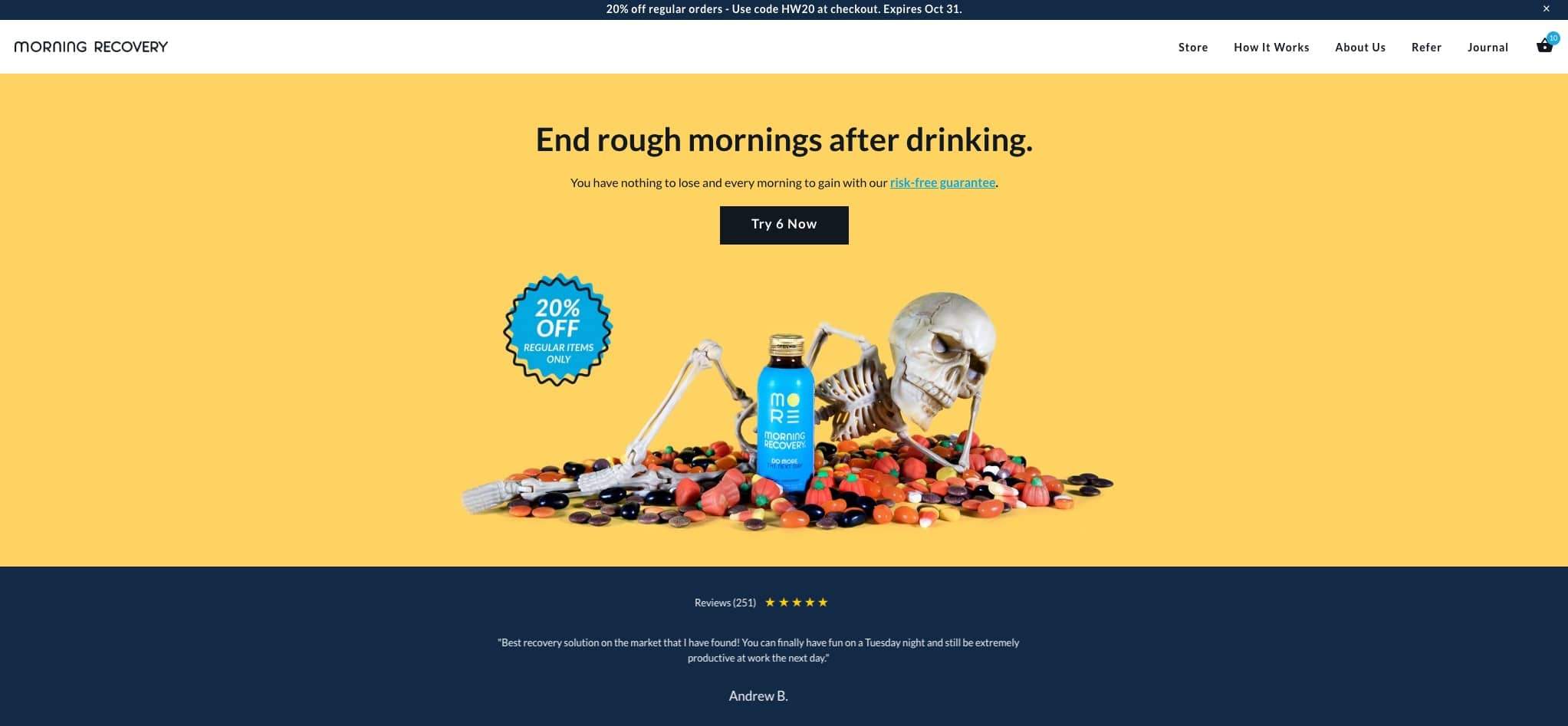
Take Morning Recovery’s homepage, for example. Morning Recovery sells a wonderful hangover remedy. Since the goal is to direct potential customers to purchase their sole product, brightly-colored and product-focused images adorn the section above-the-fold with a clear call to action that leads visitors to make a purchase.
On this homepage, there are two decisions that a user can make:
Choose to make a purchase
scroll down for more information about the products recipe or ingredients.
Most website headers use a combination of attention-grabbing headline, persuasive subtitle and captivating visual above the fold to keep new visitors on-site and familiarize them with the brand.
There are many other ways you can capture a customer’s interest from the very beginning, such as featuring a promotional banner above your navigation to advertise a special offer or free shipping.
2. Navigation. Navigation. Navigation.
The ease of navigation is crucial to a websites performance. The strength of a web page rests on its simplicity. This may seem contradictory when you want to accommodate different types of visitors but it makes sense when you consider how quickly people move from page to page on the internet.
The Header navigation should be as straightforward as possible, prioritizing the paths that matter most to most visitors. Andy Credtodina, Strategic Director of Orbit Media Studios, recommends no more than seven navigation links on your homepage.
Humans actually use an organisation memorisation method called “chunking” wherein information is broken down into smaller mental units called “chunks”.
The fewer “chunks’ there are, the easier memory retention becomes. In an influential paper published in 1956, psychology professor George Miller concluded that our short-term memory is generally only able to hold seven items at a time.
Navigation is crucial in modern design.
Websites with too many navigation options can look busy or overwhelming, increasing the likeliness that visitors will drop off or take a wrong path. Good practice is to priortize your navigation links from left to right with the most important pages at the left; being in numerical or alphabetical order doesn’t enter the picture. If you do have lots of products, collections or services, focus your main top-level collections in your homepage navigation and use a ‘mega-menu’ or a drop-down menu to create sub-navigation. Sub-navigation is an excellent way to organise your products and pages for easy exploration without initially overwhelming customers with too many options from the get-go.
Make it readable.
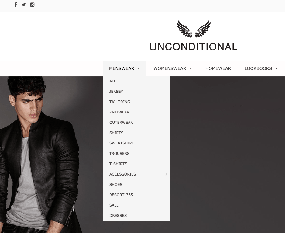
UNCONDITIONAL’s homepage, for example, balances minimal navigation and extensive inventory with a well-organised dropdown menu. Some websites also have links to their about us page, contact us page, FAQ page or other pages in their header navigation because they support their primary goals. If you do find that visitors to these particular pages don’t convert extremely well according to your goals, it may be likely these links are taking them off the path to conversion. If this is the case - it’s probably best to add these links to the footer instead ensuring they are still available but out of sight initially.
Minimal design with an intuitive design
3. Eye-catching imagery
The ol’ ‘Decision avoidance’ principles apply not only to your navigation but all other elements on your homepages. Appreciating the limits of user attention will help you emphasize what matters most when designing your homepage.
Whether you’re trying to promote your product or collection or trying to just capture email leads, the purpose of the visuals is to draw in the user’s attention immediately as they arrive on your website.
Here are a few examples to incorporate visuals into the above-the-fold section of your homepage.
Above the fold section example
This style of above-the-fold imagery often blends together a single, powerful image, direct copy, and a call to action. It works best for merchants that want to focus on a leading offer above the fold, such as a limited time sale, a flagship product, or a seasonal collection.
Above the fold imagery often blends together a powerful image, copy and CTA
A slideshow with each of your products may be a good opportunity to advertise a specific sale, group of products or high-quality product photo.
Store owners who sell a wide selection of products across a few categories often opt for this approach when there’s a few collections or pages they want to promote to visitors.
You’ll want to order the slides based on priority, with the highest priority slide first. It’s best to limit yourself to roughly three slides since users won’t be looking at a single slide for long before moving to the next step.
General rule is not to use carousel unless you KNOW how to use them.
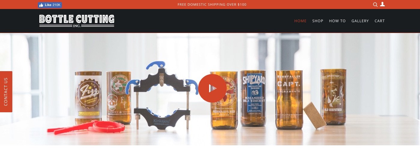
Certain brands stand to benefit from a homepage visual that tells their story. For some products, especially innovative or complex ones, it may be necessary to illustrate how to use the product before you can get visitors interested.
Take the homepage of Bottle Cutting Inc for example. Many visitors likely won’t know they need the product just yet, so the homepage creates excitement around it through a video demonstration—a natural first step in the conversion process.
Since images have such an immediate and significant impact, it’s important to make sure they’re high quality and truly representative of your brand.
4. A direct call to action
A call-to-action (CTA) is an green light on a traffic stop. It should be bright, positive and point the right drivers towards the way they need to take.
Your calls to action and what they link to should align with the next steps a customer can take towards the main goals of your homepage. That might mean linking to your latest collection or getting users to watch an explainer video to learn more.
The user should ideally understand immediately where to click because your call to action button should stand out from the surrounding design. It should pop out from the page and be easily identifiable. The longer it takes a user to find the call to action, the less likely it is that they will click or follow it.
The user should understand where to click
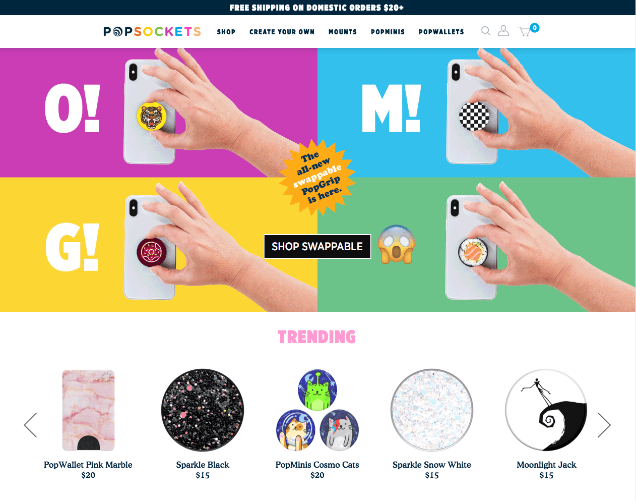
The PopSockets homepage, shown above, does an excellent job of moving the user down their ideal conversion path. Brilliant product imagery is used to catch the user’s attention, while the call to action is front and center in black and white (in contrast with the colorful background).
Nothing above the fold distracts from the main goal of the homepage: to direct the user to browse their latest product line. As you scroll down, you’ll see more CTAs to purchase other products.
5. An easy-to-access shopping cart
The shopping cart is an integral part of the homepage for most e-commerce websites.
A crucial element to ensuring your navigation is intuitive for your website visitors is to ensure their shopping cart is easy to find at all times. Making the shopping cart ‘sticky’ (sometimes called a slide-out cart) is a cart that is present and available on the screen throughout the entire browsing experience, usually in the top-right corner.
Furthermore, you could display the number of items current in the shopping cat to avoid any suprises when it comes time to checkout. A bold, eye-catching notification by the cart indicating the number of itms currently added, reminds the customers their purcahse is still in progress and encourages them to checkout and buy.
Fundamentally, make it obvious to customers when items are in their shopping cart and bleedingly obvious how to access it at any time.

Great exampe of shopping cart UI/UX
The Chubbies homepage features a red notification highlighting the number of items in the user’s cart, as well as a slide-out cart that lets users easily continue shopping or proceed to checkout.
6. A search bar (for large collections of products)
Alongside a minimilistic navigation and a ‘sticky’ shopping cart, many online stores also include a search bar to aid visitors who know precisely what they want and what it’s called. They can simply perform a text search and be presented with the products that best match their search criteria.
Minimilistic search bar.
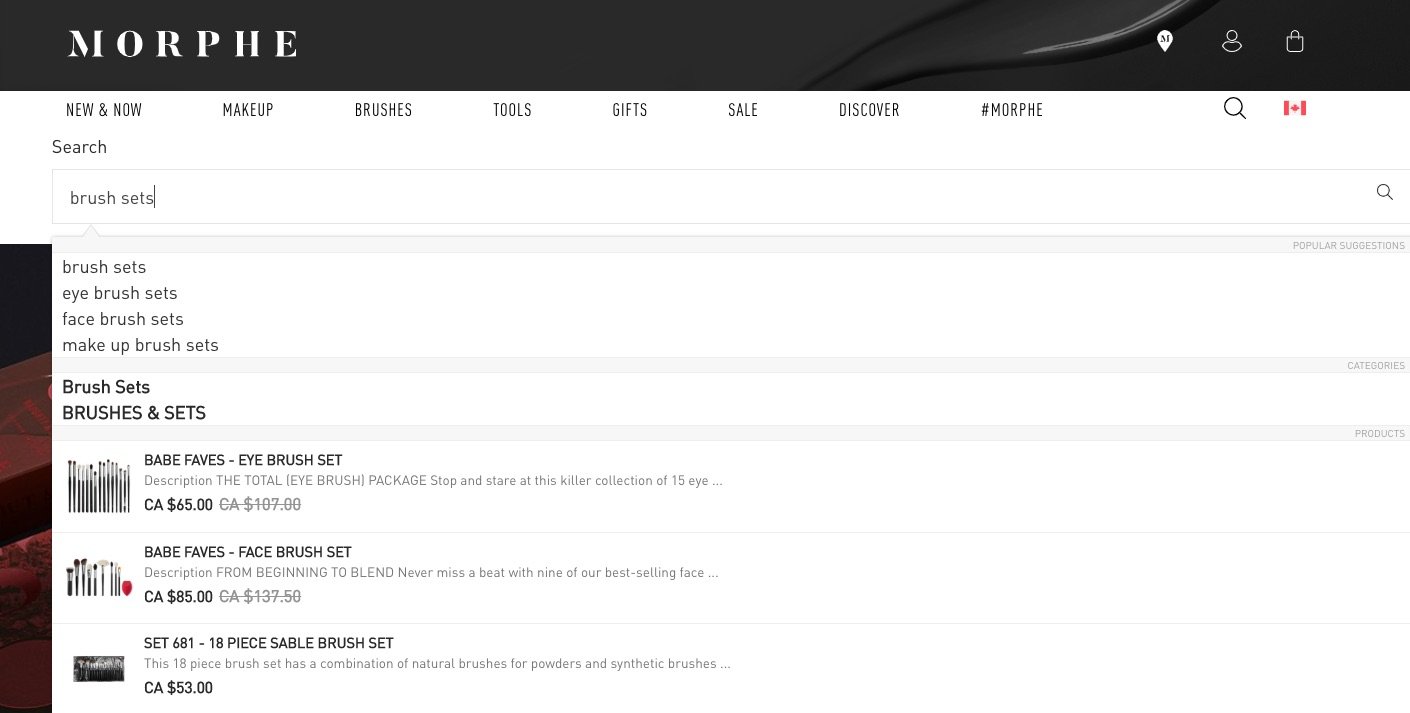
Morphe, for example, has an extensive collection of different makeup products. To make it easier for their customers to find what they’re looking for, Morphe has added a smart search bar that auto-completes a visitor’s search query with suggested products, collections, and pages. This creates a direct path to the page that the user is looking for from the homepage.
Generally, users who complete a search are more likely to convert. If your brand is selling a lot of products, an easy-to-find search bar offers an alternative to complex navigation that’s likely to turn customers away.
Beyond the fold: Other homepage elements to consider
Elements that you feature below the fold (i.e. after users scroll) aren’t necessarily less important — they often reinforce and expand on the information you’ve already introduced, provide other paths to the same conversion goal, and make other pages available to the customers who need them.
Here’s a short list of elements you can include as part of your homepage design or your footer, depending on how important they are to your goals.
1. Blogs, videos, and other content
Blog and video content can be great for SEO, but content above the fold has the potential to distract customers and draw them away from your products. You generally want your content to lead users to your products, not the other way around.
Consider placing links to your content below the fold or even in the footer, especially if the content isn’t a core aspect of your business, and allow users who’ve chosen to explore your site to find it.
If you want to promote your content, you could add a link in your top navigation, but it’s often best to do this on social media, through email, and third party sites so that it can drive external traffic to your own website.
Add a link to your top navigation
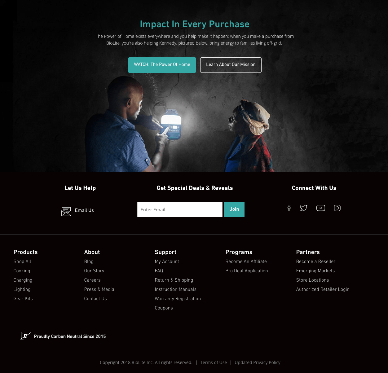
BioLite Energy, for example, sells sustainable, portable cooking and lighting appliances. Their informative, homepage video content is tucked below the fold and above the footer to avoid distracting users from their core value proposition. Everything else—from their blog to their YouTube channel—is available below if visitors are looking for it.
2. Social proof: Customer reviews, endorsements, and press
you may have heard of social proof before but it is simply an endorsement of your brand that leverages existing trust from customers/experts to earn the trust of new visitors. This can include mentions, reviews, social media posts, instagram galleries or endorsements from social influencers or well-known experts.
If you have persuasive social proof that you can leverage, your homepage may be a great place for it.
The ErgoDox homepage below provides quotes pulled from social media and shoutouts from employees at well-known companies as a testament to the quality of their product. However, this is introduced towards the bottom after establishing what their product does.
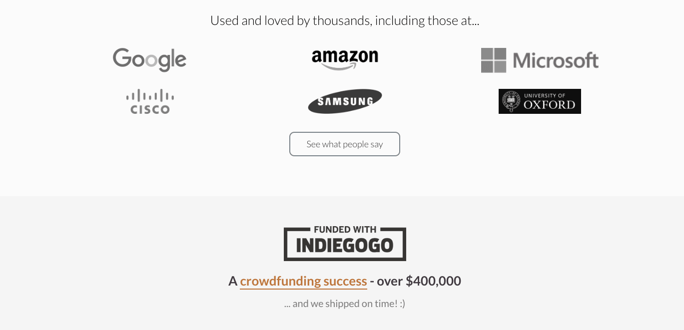
Social proof is as powerful as it has ever been
3. Low priority and strap-on products
Older products and add-on products like watch straps may be worth shifting towards the bottom of your homepage. You want to lead with your flagship products or draw attention to your newest product lines, after all.
Less expensive products that compliment your main products act best as impulse buys used as an upsell at checkout, but they can also be included on the homepage below the fold to make visitors aware of them—if you’re selling a product that requires replacement parts or refills.
LIV Watches, for example, naturally focuses on watches, but advertise their premium add-on products like straps towards the bottom of their homepage.
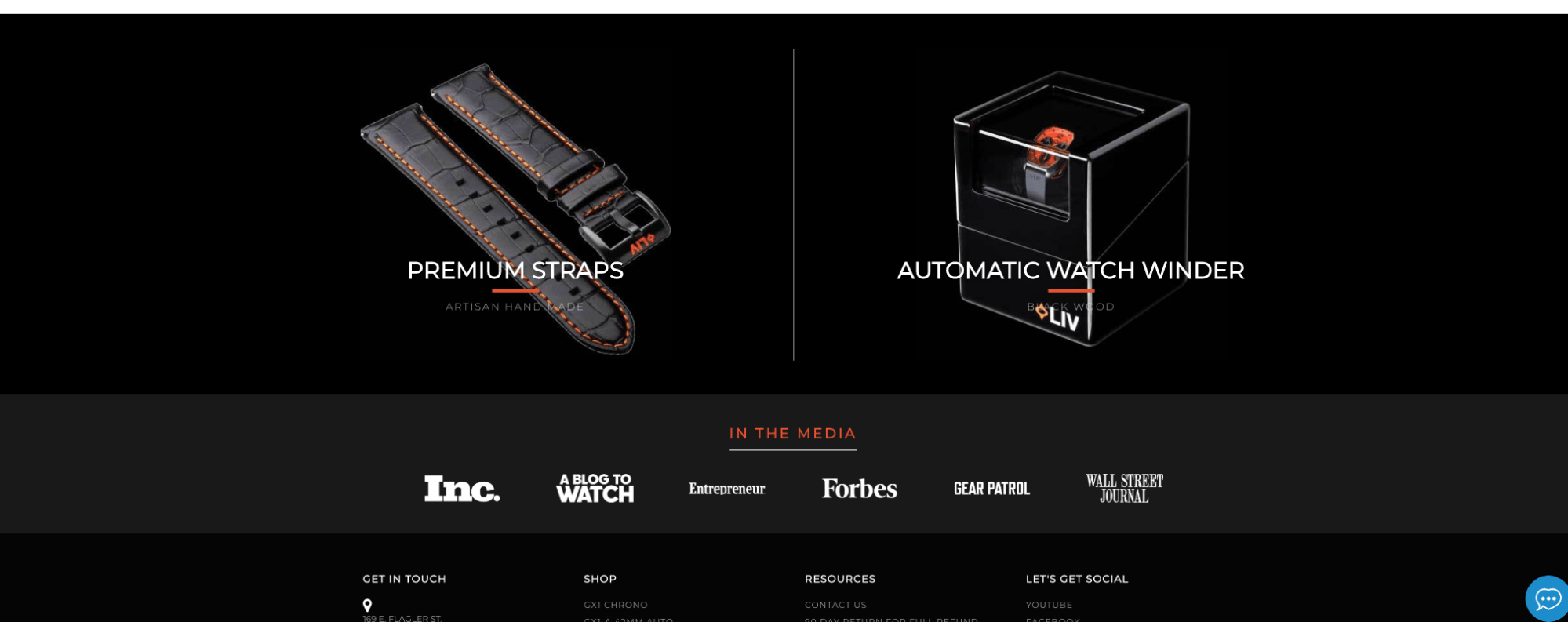
Low priority and strap-on products
4. Less important pages
Pages that you consider low priority can differ depending on your business model.
Generally, pages such as your Terms of Service, Privacy Policy, or Return Policy work best in the footer. Since links to these pages are so often kept in the footer, many visitors should intuitively look there if they need to get to these pages.
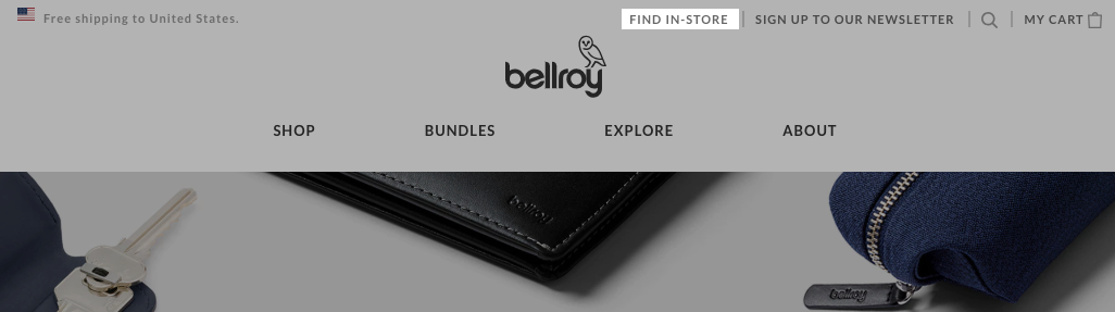
Others, like your about us page, contact info, store locations, or order tracking pages can also be added to your footer. But if they truly help prospective customers buy from you, or help you accomplish another key goal, then you can consider prioritizing them in your top navigation or even your homepage design.
For example, a merchant selling a subscription service might be able to significantly curb their support tickets by adding a prominent FAQ link in their homepage navigation. Or, like in the case of Bellroy where their products are often purchased in-person, you can help visitors discover the nearest physical retail location via a more prominent Store Locator link.
Add unimportant pages to your footer, making space in the main nav.
In trying to decide if a page is low-priority, ask yourself how much you stand to benefit if you direct visitors to that page right away and whether it serves to distract them away from or draw them towards your intended outcomes.
Keeping mobile homepage design in mind
Mobile web-traffic has consistently continued to grow over the last few years. Since a good portion of your traffic is likely to come from mobile sources, every decision you make about the design of your homepage should take mobile users into account.
Simplifying your homepage to direct users toward a specific set of actions becomes even more important for mobile users.
Design for mobile but expect desktop visitors
The elements of any website should adjust based on screen size. However, keep in mind that images that look stunning on a wide desktop screen could be cut off or cropped in unsuual ways on a mobile screen. Calls to action can be harder to find or moved in a way that makes it more likely for visitors to click away.
Improving your homepage design over time
As you’re probably aware by now, there’s no single best way to design your homepage. Factors like user demographics, branding, number of products, marketing channels, and more can influence your user’s behavior in a myriad of ways.
That’s why it’s so important to always view your homepage as a work in progress, using the traffic and sales you generate to measure the impact of your homepage and make adjustments over time.