What is a Landing Page?
If you’ve spent any time in the presence of a digital marketer, you’ve probably heard the term ‘landing page’. In this short article, we’ll highlight what a landing page is, why you may want to use one and what the potential results could be by using one.
For starters, a landing page is a standalone web page which has been created for the specific purpose of improving the results of a marketing or advertising campaign. A landing page is what a potential customer visits when they have clicked on an online advert such as a Google ad or Twitter ad (or something similar).
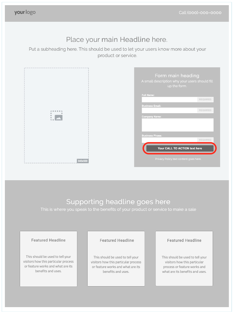
Landing pages are designed with an extremely narrow target. Usually, landing pages are designed to elicit a specific action from the visitor which is also known as a Call-To-Action or CTA.
The Difference Between a Homepage and a Landing Page
Take a look at the following 2 diagrams; 1 shows a homepage and the other shows a landing page. The blue areas highlighted on each diagram represent links on the page. As you can see, the Homepage (on the left) has 15 links and the one on the right only has 1.
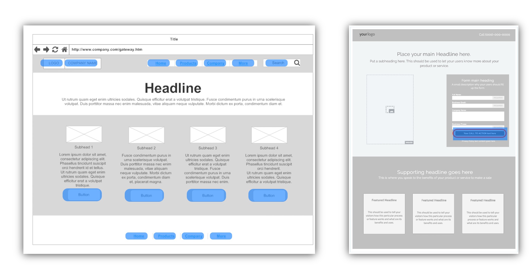
Reducing the amount of links on your landing page is critical to reducing the number of choices your visitors will have to make. When there are few choices, the only choice your visitor should be making is whether to click your CTA or not. Expert marketers doing PPC advertising always use a dedicated standalone landing page as the destination of their ad traffic because other pages insist the visitor makes more than 1 decision.
Why are Landing Pages so critical?
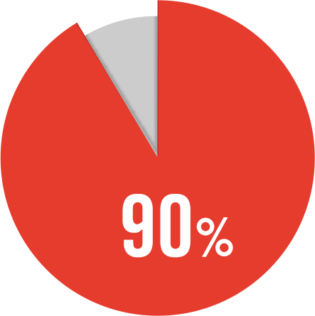
As landing pages are designed with a very specific target, it makes them perfect tools for increasing conversion rates of marketing campaigns. Lowering conversion rates would also reduce the cost of customer acquisition, so it’s a hugely powerful tool to apply to any and all marketing campaigns – using a landing page has been known to increase conversion rates by up to 90%.
Far too many companies send their advertising, email or social media traffic to their homepage. This is one of the biggest tragedies of the modern marketer and a huge missed opportunity for the business. When you have a targeted marketing campaign which will undoubtedly draw in a constant flow of potential customers, you can introduce a landing page to increase the chances of selling one of your services/products or capturing their contact details to follow up with later.
For example, if you’re currently running a Google Ads PPC campaign and one of your ad groups is outperforming the others with an incredible Click-Through-Rate (CTR) but when the traffic reaches your websites homepage, you notice either the bounce rate is high or that there aren’t many clicks. This represents the second-best time to introduce a landing page (the first being when you created the campaign itself).
Introducing a landing page here, would help with a number of different elements. It would allow you to.
• Answer all of the visitor’s questions about the product or service the advert described.
• Showcase the Unique Differentiators of the product or service.
• Include product or service specific images to add further context and increase attractiveness.
The NET result of achieving all of this would be a potential customer who a) clicks on your Google Ad to find out more, b) learns more about the product you mentioned in the ad and c) is either invited to buy it or submit a sales enquiry.
Let’s look at the flow if you didn’t use a landing page and just referred the same potential customer to your homepage. The potential would a) click on your Google Ad to find out more, b) look around your homepage and navigation c) click through to the page which might contain the product information they wanted (potentially repeat this step if they click into the wrong page) and d) find the buy button or enquiry button.
By comparing the two, you can see that a landing would remove some guess work, potentially some navigational clicks and perhaps make it a little easier to find out what the next step would be. Let’s face it, anytime you think there is a chance that your customer could change their minds, they’ll take it so removing these points from the user flow is crucial or improving conversion rates and serving your customers better.
What elements make a landing page most effective?
What specific elements of design of a landing page makes it different to your home page? Here is a short list of the most important elements to make sure your landing page is better optimised for use in marketing campaigns.
Limit Navigation: You’ve brought your targeted traffic to a page where they can take your desired action. Don’t leave any surplus decision on the table. Remove any navigational elements from the landing page so that your visitors don’t exit the page without completing the CTA. This means, you should hide your navigation bar and other UI elements which could pull your visitor to a different page.
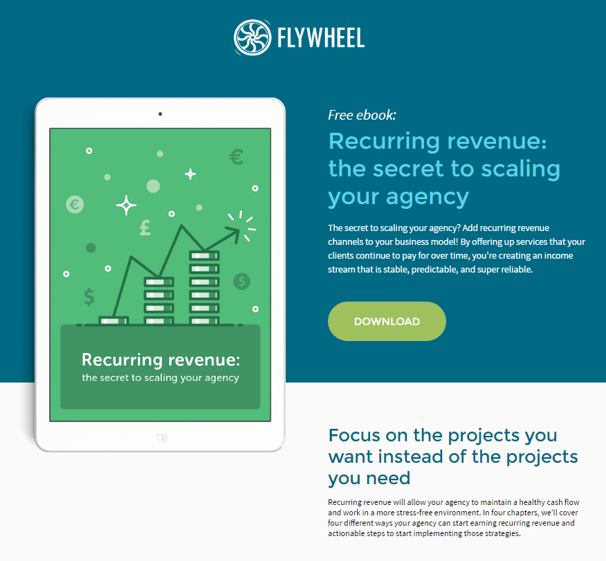
Deliver Value: The most important part of all of this is to provide value to the visitor. This means that you must answer the question they had before clicking your ad or providing something in return for taking their contact details. Perhaps you offer a free eBook in return for collecting their contact details or perhaps you give them free software in return for their subscription to your newsletter? Just make sure you give them something valuable.
Enable Social Shares: If you give great value, then there’s a strong possibility your visitor will want to share the page with colleagues, friends or family. Make this super easy by adding a click-to-share capability – include buttons for Facebook, Twitter, Instagram, Pinterest and any other social network you think your target audience will want to use.
Keep It Very Short: It’s proven that introducing friction into your marketing funnel (the journey each of your visitors takes until they become a customer) dramatically lowers your conversion rate. By keeping your landing pages short and sweet, you minimise the possibility of introducing something your audience won’t like or will get distracted with.
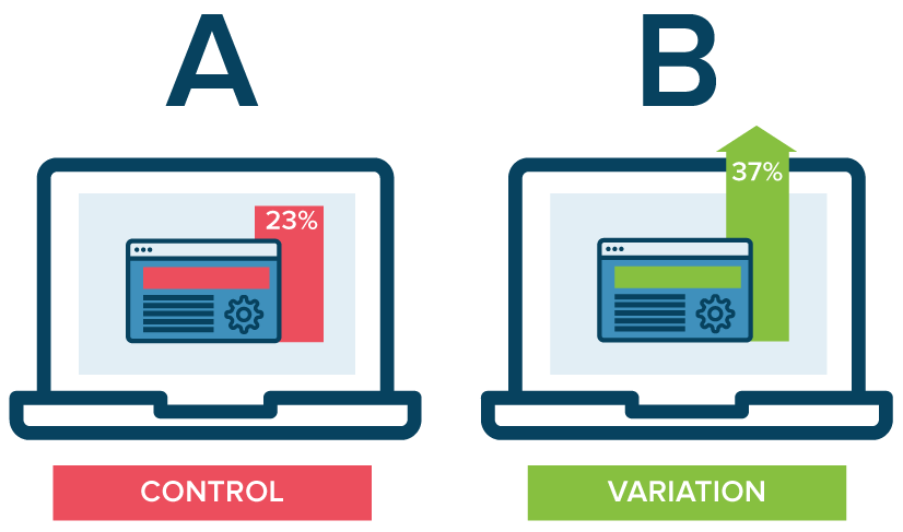
Test & Optimise: You’ll have plenty of numbers coming back at you from your Google Ad campaign and your landing page analytics. With all of these metrics, you’ll be able to look at every single activity on your landing page. The key to a successful landing page? Optimisations. At a minimum, you should run 2 versions of your landing page – one should contain a unique element, maybe one has a different hero image or describes the product in a different way? It can be anything (and should be) because we’re not looking at what the difference is, just the impact of the difference. Simply by changing the colour of the background, you might increase the conversion rate by 10%.
This simplicity is what makes landing pages the best option for increasing the conversion rates of your Google Ad campaigns and lowering your cost of acquiring a lead or sale.
To fully understand the importance of a landing page within your marketing campaigns, compared with the other pages on your website, such as your homepage, it’s important to consider the differences in choice you’re providing your visitors. With landing pages, the choice should be constrained because we’re looking for just 1 but with normal pages (such as your homepage) the choice should be more numerous because we want them to explore.
