If you’re not running a super fancy SaaS business, then chances are the advice you come across online about setting up ad campaigns is frustratingly not relevant to you.
When running a business that relies on inbound sales enquiries rather than software downloads, free trials or downloadable ebooks, it can be challenging to know where to turn for guidance. Crossing the streams and looking for answers relating to the combination of digital marketing and traditional business processes can present all sorts of red herrings and dead ends.
Today, we’ll share some of what we’ve discovered running successful paid search campaigns for traditional businesses. Our Lead Generation campaigns have exploded growth for some clients, such as Cambridge Worktops and Ligna Consultancy. For others, it has provided a stable and steady flow of new customers.
You know it - I know it.
If you’re reading this blog, chances are that you know the most efficient way to obtain new customers online is to use paid search ads on popular search engines like Google or Bing.
What you may be unsure of is the value of using a Landing Page in combination with your paid search ads. So, let’s take a quick dive into Landing Pages to get you up to speed with the basics and prepare you for launching your own.
The Basics of a Good Landing Page
It all comes down to the action you want the prospective customer to take. You’ve shown them something already in your ad, and they’ve been interested enough to click for more information, so what else do they need to either submit an enquiry, call your sales team or purchase right there and then?

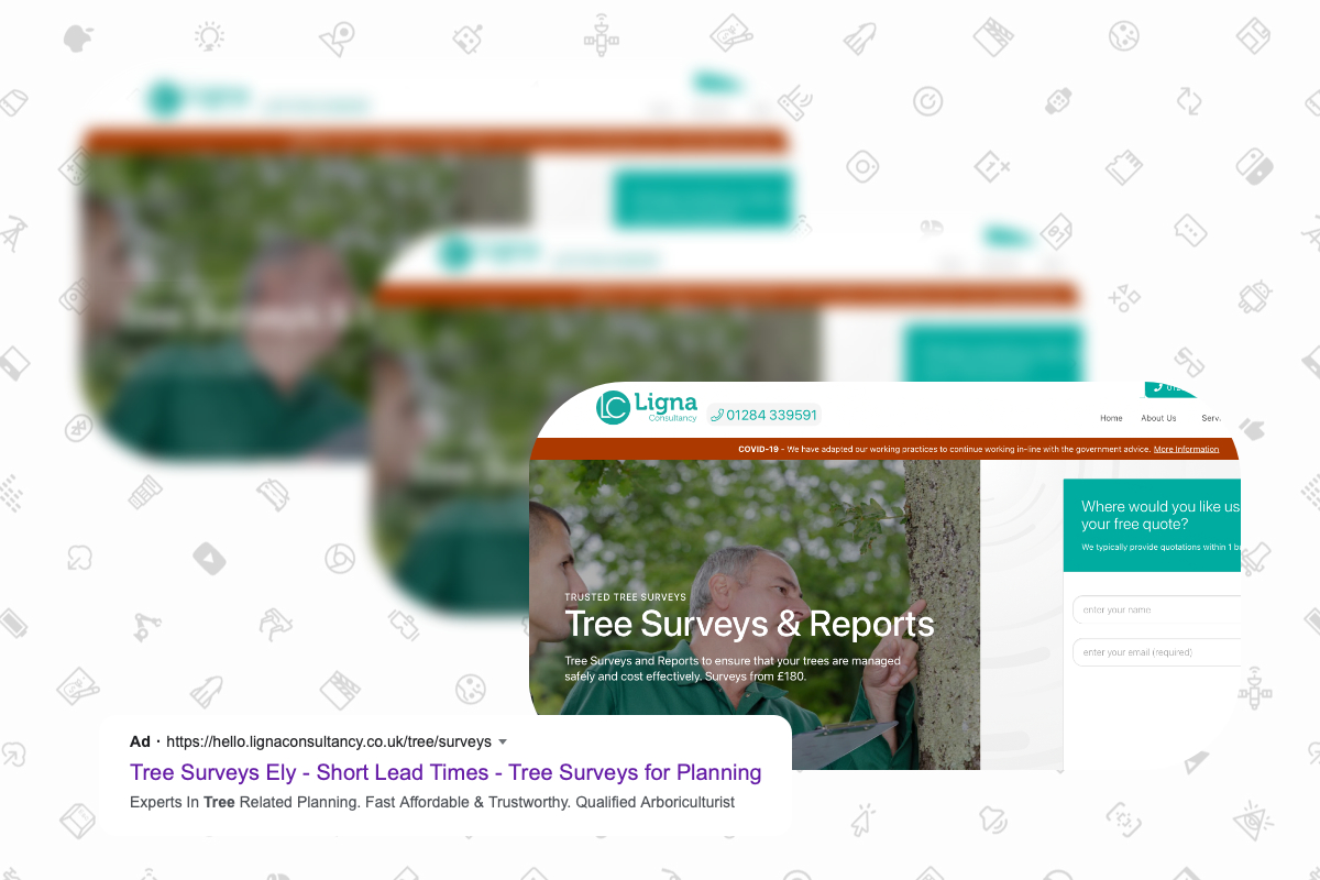
Landing pages that match the origin ad brings everything into focus.
1. Your Landing Page should reflect your ad
If you’re sending prospective customers to your homepage, then it’s probably going to show information regarding all of your products - and for someone who is looking for a specific product/service, this is going to annoy them, deter them or just slow them down. It’s easy for them to get distracted, suffer from choice paralysis or not discover what they were initially looking for.
Establishing a landing page highlighting just the product in your ad ensures prospective customers will find the product/service they wanted from your ad. Presenting them with a simple, one-product Landing Page removes any doubt that they won’t find what they are looking for, and this is crucial for a high-performing campaign/Landing Page combo.
2. Straight. To. The. Point.
It can be challenging to hear the interesting bit when you’re stuck talking to a blabbermouth at a family party. They may have hopped on a Tesla rocket and orbited the moon, but if they spend most of their time speaking about the potato salad, you will switch off and get bored. The same goes for your Landing Page.
Your Landing Page needs to connect your prospective customer with the product/service they saw in the ad ASAP. If they click on your ad selling sausages, give them a way of buying the sausages they clicked on first - don’t harp on about the origins of the sausage or the history of the business behind the sausages. These people don’t care - they just want sausage!
Show them the sausage straight away and give them the ability to enquire or purchase it right away - you can talk about the origins further down the page but for the ones that want it, let them have it. The same goes for your products and services. Let them eat cake!
3. Don’t let them wander off.
A Landing Page isn’t a website - nor should it be. With your website, you want the user to explore and discover your available products and services. You want to encourage them to search for things they’d like because you don’t know what they set out for - so discoverability is hugely important.
For someone you attracted via an ad, you know what they’re looking for. They clicked on your ad that advertised it so it makes sense that you should only show them the item or service in your ad. Showing them anything else outside of this product/service can lead to a decrease in conversions.
4. Avoid using gimmicky sales things.
LIMITED STOCK, BUY NOW, BEST EVER PRICE are all throwbacks to a market square salesmanship and deserve to be left. A prospective customer can smell authenticity from miles away, and the smell of the salsey-type statements above will make your business seem less attractive and legitimate. Be honest. Be transparent. Prospective customers are savvy, and they see through the hype.

Make it easy for prospective customers know how to contact you.
5. You want them to contact you, right?
This seems like an obvious one, but many overlook it. If prospective customers want to contact your business, then showing them contact information as soon as they land on your page is a solid idea.
Include a telephone number, email address, physical address (if they can come and visit you in person) and an online form. Show this as soon as possible; otherwise, you may risk losing them if they need to dig into your page to find out how to contact you.


